
At a glance
Ausventure was sitting on a goldmine of premium travel packages, but their digital experience was stuck in the past. Users were getting lost in static pages, and the path to purchase was confusing.
We partnered with them to architect a 0-to-1 redesign, turning a brochure site into a high-performance booking engine that converts curiosity into revenue.
The friction problem
In the world of high-ticket travel, trust is the currency.
Solution: Part 1
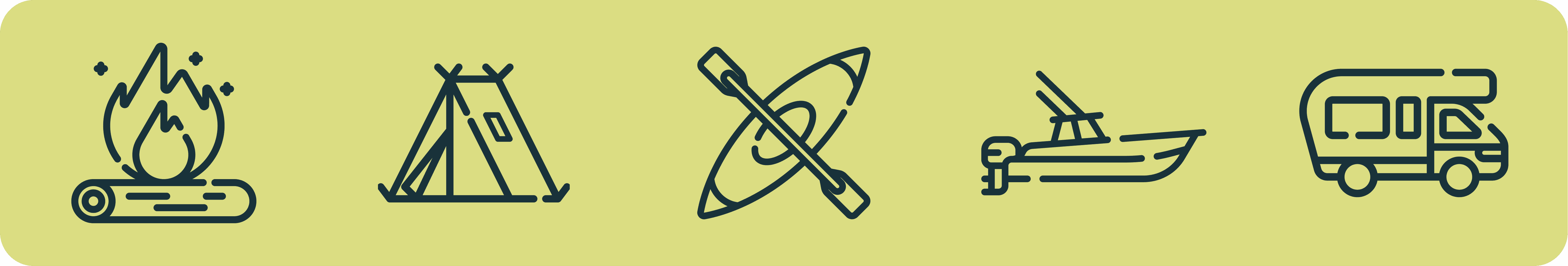
Systemizing the adventure: A modular design language
Archivo & Figtree
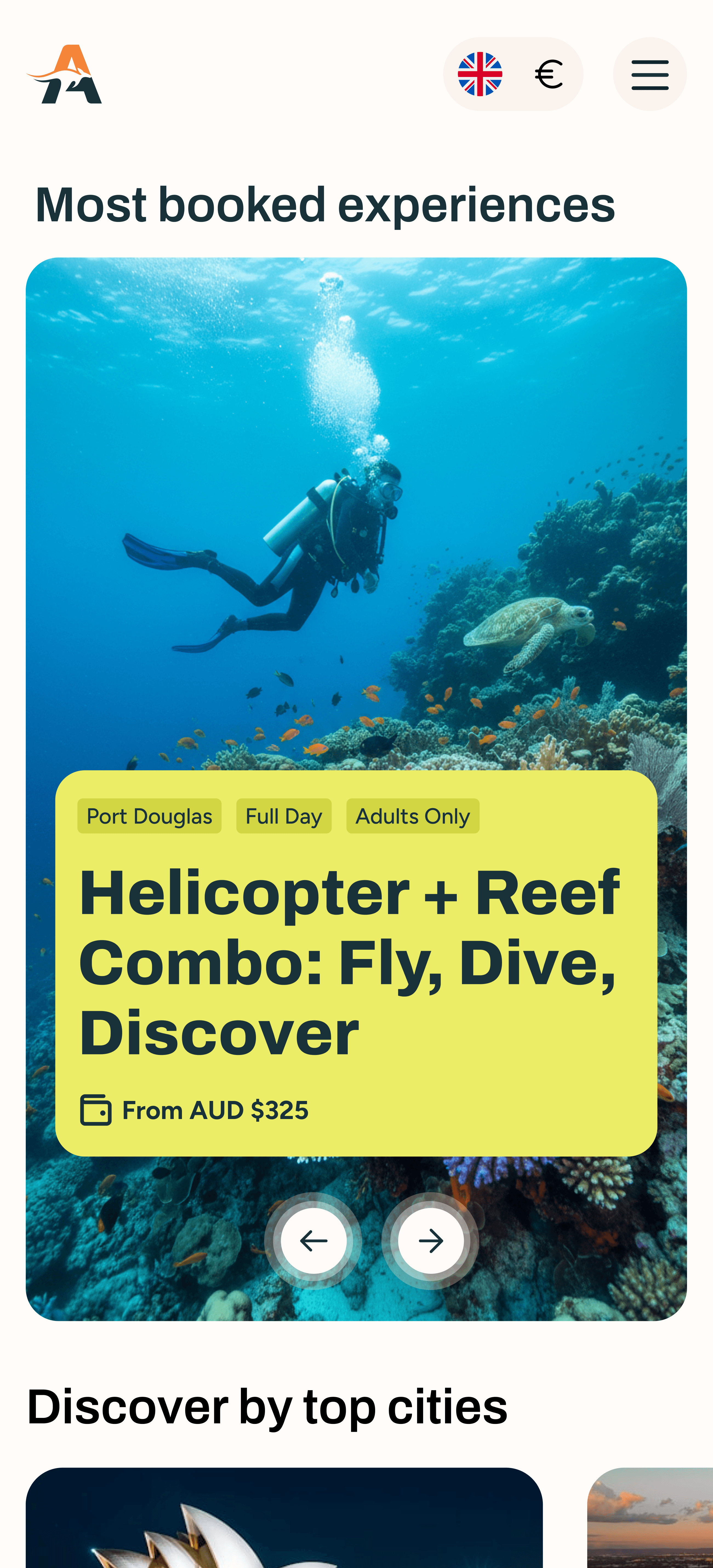
Experience Australia
& New Zealand.
Like never before.


You haven't dived,
till you dive in the

"
What stood out to you the most about working with us?
"Your professionalism, creativity, and attention to detail throughout the entire project have been exceptional. I especially appreciated the clear communication – it made the whole process smooth and enjoyable from start to finish. It’s been a real pleasure working with such a dedicated and talented team! I am beyond exciting for our new website to go live."

Anne Dressel
Founder, Ausventure Travel
Solution: Part 2
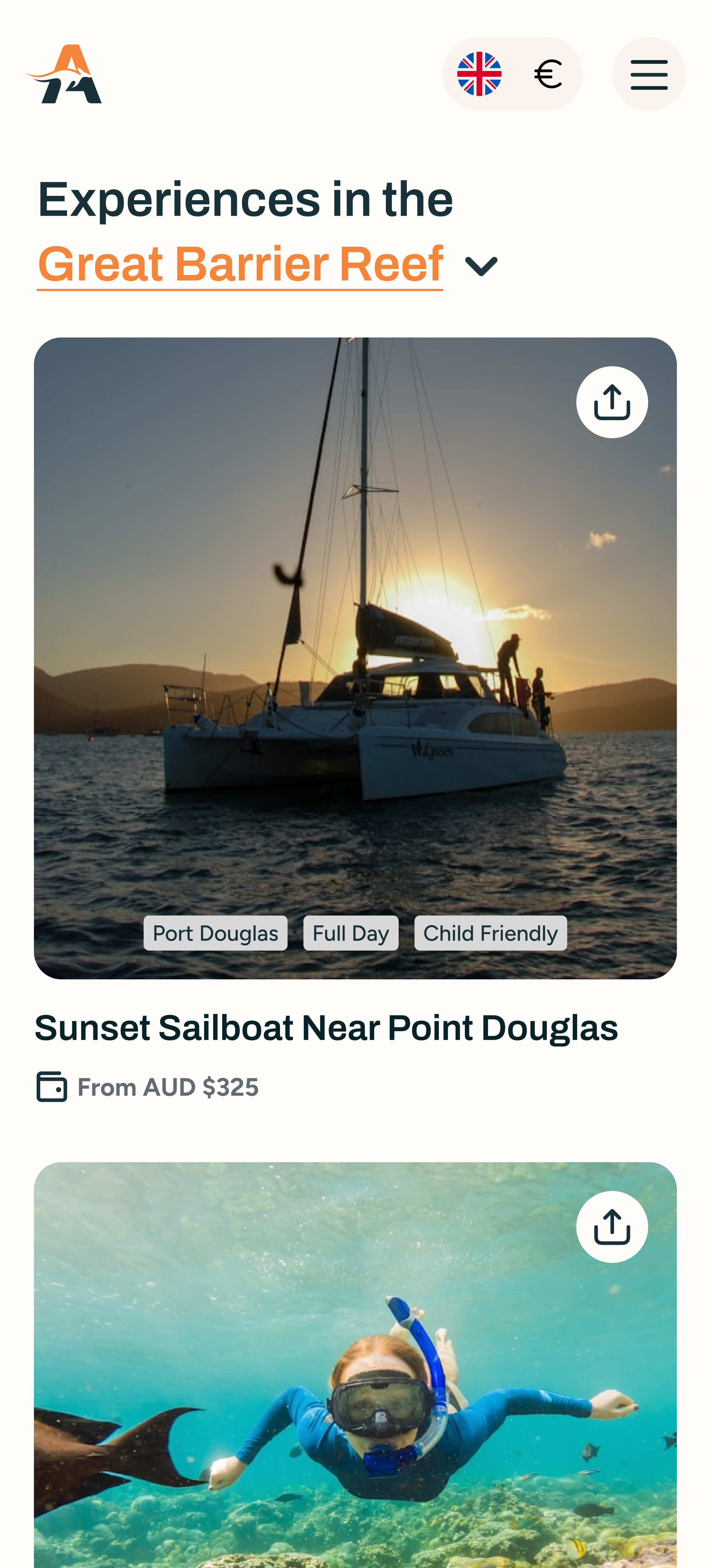
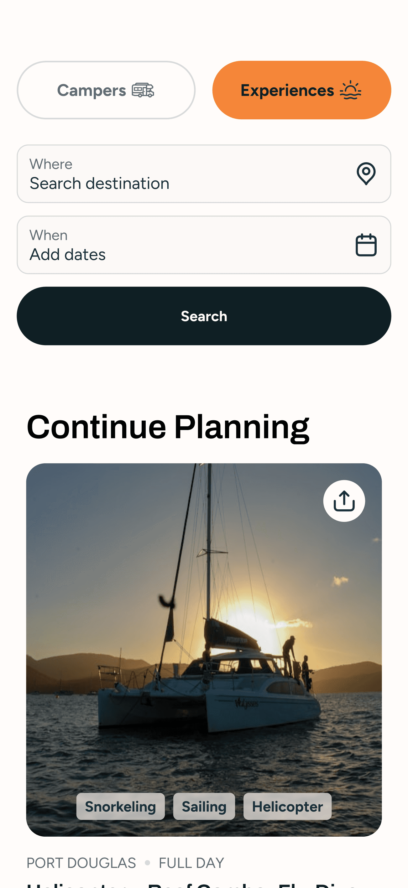
The Discovery Engine: Reducing cognitive load with smart inventory filtering


Measuring KPIs
We simplified the inquiry flow and made it more intuitive, leading to more users completing the process without drop-off.
Before: Confusing form with too many fields
After: Clear structure = higher completion rate
Key info like pricing, availability, and route details were made more accessible, helping users stay on track and reducing abandonment mid-process.
Before: Users left mid-way due to uncertainty
After: Friction removed = more users reaching final step
We brought testimonials and press coverage into high-impact zones, reinforcing trust where it mattered most.
Before: Trust-building elements were buried
After: Clear, timely proof = more confidence to book
We clarified how to get in touch, via WhatsApp, forms, or email, especially during key decision moments, making help feel close and accessible.
Before: Users unsure how to follow up
After: Easy contact = more converted leads
Instead of forcing users through a complex navigation bar, we let them discover organically through contextual cues and progressive reveals.
Before: Narrow engagement and unclear browsing paths
After: Seamless flow = more curiosity, more clicks, and deeper exploration
The new design system elevated Ausventure’s brand from a travel operator to a trusted trip-planning partner, professional, adventurous, and credible.
Before: Inconsistent or generic branding
After: Elevated design = higher trust & differentiation

